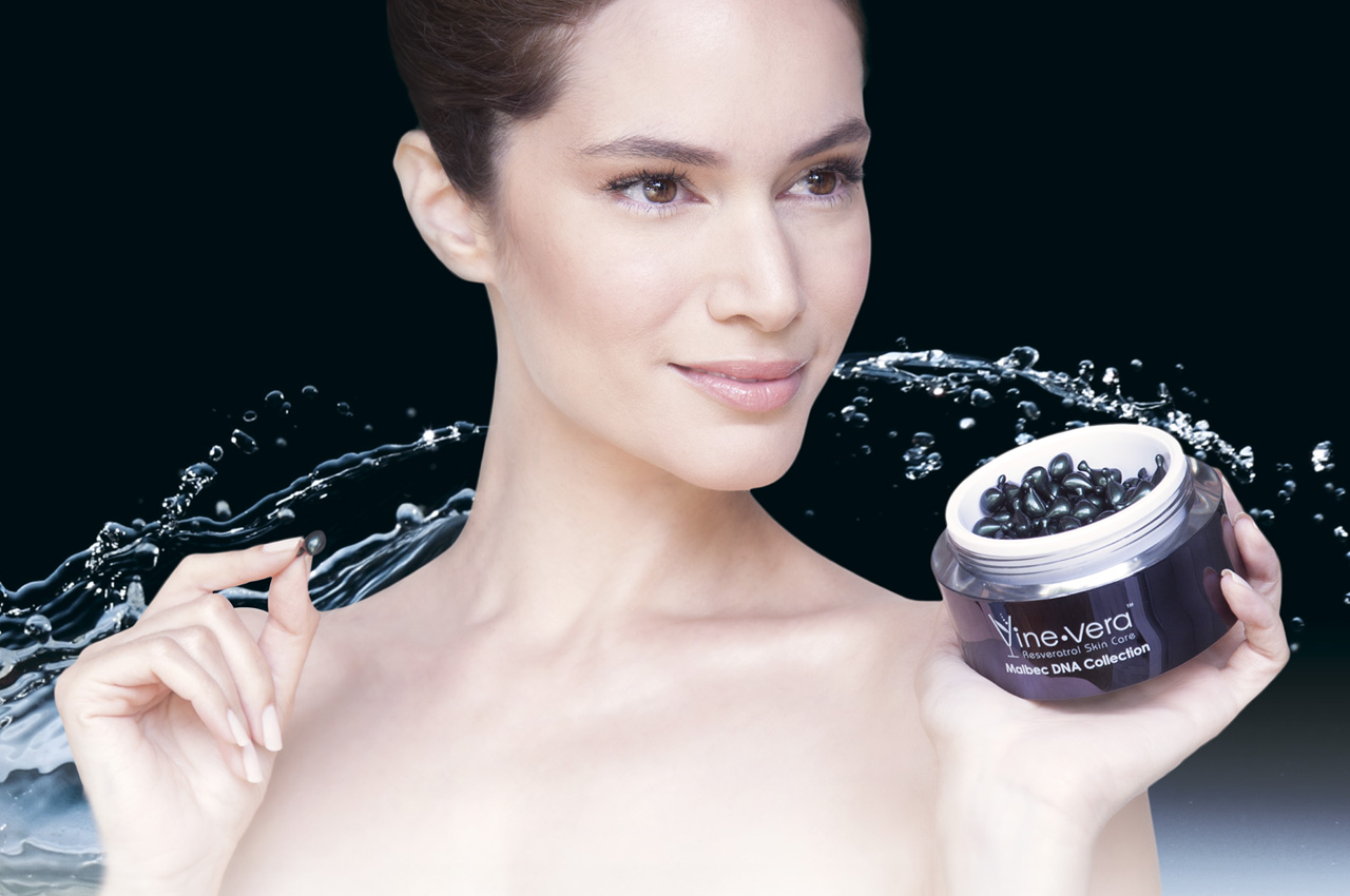
Since 2011 Vine Vera Resveratrol has been one of the top-selling skin product lines in the US.
The objective was to reflect the sophisticated value of wine in promoting this line. The various elements of wine would have to be combined with the concept of skin care. Additionally, a variety of grapes was to be integrated into this brand to provide options.

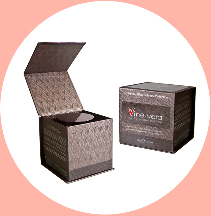
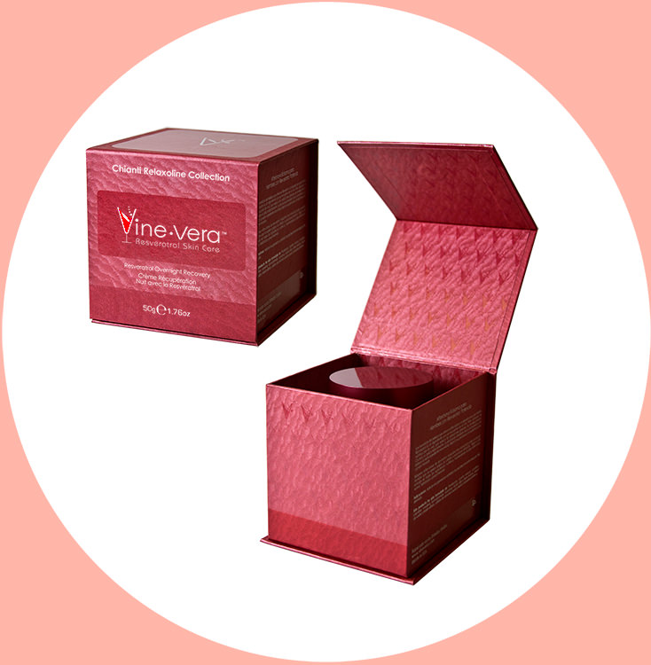
I used the typographic palette and logotype design to evoke the elegance and sensual nature of wine. The packaging bursts with red and silver foil textures in three different sizes. UV glossy treatment was used to impart a degree of sophistication to this collection. 10 distinct grape varieties are represented by the various selection of matter paper. Below are two examples of 50g packaging designs.
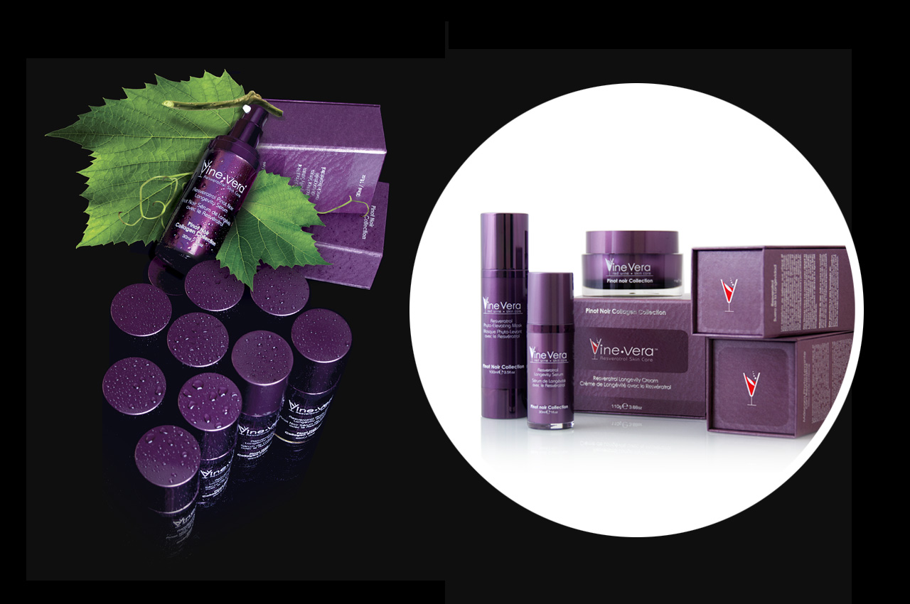
I arranged the bottles into a cluster of grapes to represent the natural ingredient. In this product photography, the vivid colors and arrangements successfully express the robust nature of the line.